Global Site
Displaying present location in the site.
Development of Easy-To-Use Self-Service Terminal UI for Filling Stations
Vol.8, No.3 July 2014, Special Issue on Social Value Design - Contributing to Social Value InnovationsIn recent years there has been major growth in the number of Self-Service Terminals installed at filling stations. The "easy to understand, easy to use" aspect of these widespread terminals is important not only for the user but also from the vantage point of the filling station proprietor due to its key role in increasing sales and streamlining business efficiency. For this reason, we have developed a new UI (User Interface) that gives top priority to user-friendliness while addressing the needs of business proprietors and station attendants, drawing upon the expertise of HCD (Human-Centered Design) specialists including workflow analysis, verification and evaluation.
1. Introduction
The installation of self-service filling stations (hereinafter "Self-Service Stations"), where it is the driver who pumps the gas, was legalized in Japan in April of 1998. The number of Self-Service Stations has increased rapidly in recent years, spreading to over 8,600 locations in Japan as of June 2012, becoming a familiar entity and important element of the social infrastructure.
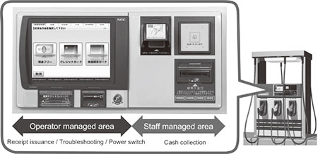
Although Self-Service Stations are equipped with various types of safety devices and precautions are taken by station attendants (supervisors), it is necessary for the actual user to pay special attention to safety. The Self-Service Terminals by NEC Infrontia Corporation are devices that enable users to order and pay for gasoline by themselves at filling stations (Fig. 1). It likewise incorporates various safety measures to enable people to fuel up their cars securely and safely.
2. Societal Needs of Self-Service Terminal
The safety and security requirements of the Self-Service Terminal by the social infrastructure include sustainable operation of the gas pump as well as theft prevention. Even if a malfunction occurs at one terminal, partial system redundancy enables speedy resumption of business as usual. And to deter crime, a robust chassis and reinforced locks have been incorporated.
More than 10 years have elapsed since the start of Self-Service Stations in Japan, and with their spread there is heightened demand not only for safety and security but also for "easy to understand, easy to use" operation even by first-time users. This is also an important point for business proprietors, as it enables a large number of customers to be gathered.
With filling stations operating 24 hours a day, and the diversity of skills among station attendants, the improvement in business efficiency brought about by "ease of use" has become an essential factor in selecting terminals. The UI (User Interface) is an especially important factor contributing to "ease of use" and competition is becoming increasingly fierce among manufacturers.
Moreover, user considerations can be divided into two types. One is the design of areas that are touched directly by the user, or in other words the hardware, including the ease with which paper currency and cards can be inserted or coins can be deposited. The other is the UI which enables user operation while following the guidance being shown on a display screen. For first-time users, the UI serves as a step-by-step guide to the next required selection, and supports smooth and safe operation.
In this paper, we will introduce how our new UI was developed using HCD (Human-Centered Design) methodology, which aims at achieving what any user will feel is "easy to understand, easy to use" as part of the social infrastructure.
3. Development Process According to HCD
3.1 Clarifying "Easy to Understand, Easy to Use" as the Objective
Prior to development, specific goals for attaining "easy to understand, easy to use" were considered, of which the five listed below were selected.
- (1)Incorporating touch panel operation and display methods that many people are familiar with (due to the spread of smartphones and tablets making touch panels a commonly-used apparatus) so that even first-time users can operate it easily without feeling intimidated.
- (2)Addressing the needs of those who are not familiar with Self-Service Stations such as the elderly and women, and accommodation of UD (Universal Design).
- (3)Enhancing user benefits through a signage function that displays messages and ads, offering a point service loyalty program, etc.
- (4)Improving response speed compared to conventional units (because during touch operation the lack of displays such as "currently communicating" left the user wondering of the terminal was running or not), and simplifying operation (because there were too many steps required for fueling, seeming overly complicated).
- (5)Accommodating the installation site environment (daytime, nighttime, morning/night) by adopting screen graphics and coloration that are easily recognizable regardless of the time of day.
3.2 Design Steps Leading to Final Product
3.2.1 Research
We gathered, organized and clarified the standards and criteria necessary to maintain safe and secure operation in terms of the Universal Design, Accessibility and operability of the Self-Service Terminal UI.
- 1)Color coding according to type of hazardous material
High octane = Yellow, Regular = Red, Light oil = Green, etc. (Item 25 of fire code) - 2)Adherence to JIS standards
Character size, button size, contrast, blinking speed, etc. (JIS Z 8528-2, JIS Z 8519, JIS X 8341-3)
3.2.2 Design
We designed an operational workflow after evaluation by HCD experts, then reviewed Wireframes based on that.
- 1)
Evaluation and design of operational workflow based on review
HCD experts reviewed the operation screen progression from the two perspectives of the Self-Service Stations user and the station proprietor/attendant (Table 1), then applied a review type heuristic evaluation*1 to decide on the most appropriate operational workflow design (Fig. 2).Table 1 Example of review points.

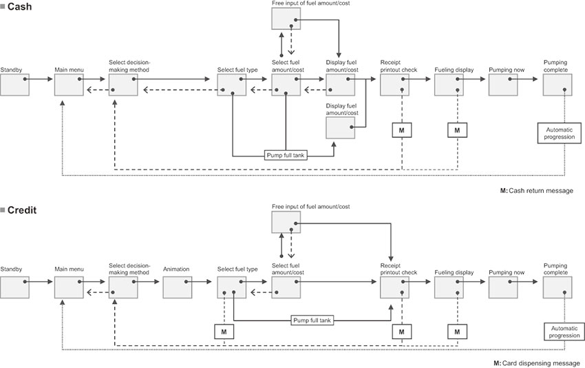
Fig. 2 Operational workflow evaluation and design. - 2)
Review of Wireframe
Based on the most appropriate operational workflow designed in the previous section, the Wireframe*2 was evaluated repeatedly with regards to the following criteria (Fig. 3).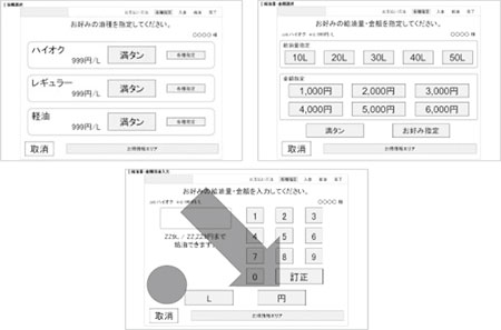
Fig. 3 UI review and Prototype creation - Layout of required information and function elements on the screen
- Readily viewable information volume
- Button size required to keep button held down with finger
- Operational flow within the display screen
Attention was paid to the following content regarding each of the reviewed items. - Is the button layout consistent with the natural flow of vision and operation?
- Are the button sizes sufficient to avoid accidentally pressing adjacent buttons?
- Placing bigger buttons for recommended choices (such as adding a "Full Tank" option).
- Are the buttons that users want available (such as cost and fuel amount selection buttons)?
3.2.3 Assessment
Based on the Wireframe developed using the previously mentioned method, a Basic Prototype was created for evaluation and the direction was narrowed down.
- 1)
Production of Prototype
Based on the on-screen structural elements reviewed using the Wireframe, we created a Basic Prototype using the button and animation functions of a presentation software to depict the screen progression. Using this Basic Prototype, those in charge repeatedly reviewed operations through this virtual experience to confirm the screen progression and narrow down the specific elements that required brushing up (Fig. 4). The review points are listed below.- Adequacy of screen layout and button size
- Adequacy of screen progression upon cancelling an operation
- Consistency of screens
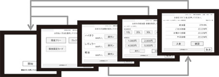
Fig. 4 UI review and Prototype creation - 2)
Narrowing down the design direction
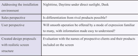
We created multiple visual depictions of the screens depending on the points that were given priority from among those that were decided on as objectives, such as addressing the installation environment or emphasizing sales, and reviewed them (Table 2).Table 2 Criteria for deciding on the design direction
The final concept was decided by consolidating the design direction, for which we implemented an in-house questionnaire pertaining to prospective users and sent multiple suggestions to each of our nine sales offices to acquire the opinions of actual customers, after which the persons in charge discussed the issues and brushed up the plans (Fig. 5).
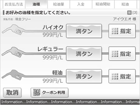
Fig. 5 Consensus of design direction (streamlined and easy to understand).
3.3 Incorporation into Actual Terminal
Based on the decided upon concept, UI details were deployed into each screen and confirmed while applying minute revisions and adjustments. Moreover, in preparation for development of the actual terminal, we issued a directive on the graphical elements and design that were to be used in composing the screen, thereby creating an environment where the developing engineer could apply his work smoothly.
3.3.1 Detailed Confirmation of Operability and Tuning up
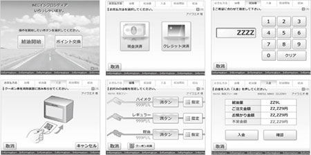
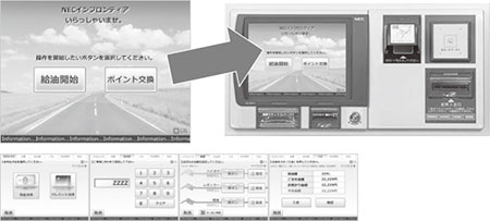
Actual text was incorporated into the on-screen display images for all of the screens, and these were imported into a Visual Prototype using a presentation software, which was embedded into the actual terminal unit for checking. After examining the difference in color reproduction between the development environment (PC) and actual display, verifying the visibility under expected usage conditions and environments, and simulating the actual screen size and panel angle, we applied minute revision and adjustments (Fig. 6).
3.3.2 Issuance of Directive Regarding Display Elements and Design
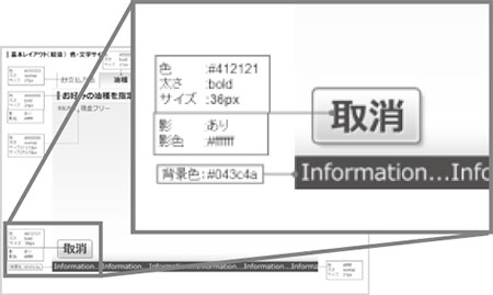
In order to facilitate efficient teamwork between the developing engineer and HCD experts, we confirmed the size and shape of templates and graphical elements the HCD expert should provide, as well as the division of work between the two. And to enable the developing engineer to apply additional changes to the functional HTML/CSS screens himself, we drafted a design directive (Fig. 7) outlining the color and size of characters, positioning, etc. so that the values allowable under UI rules could be easily understood.
3.3.3 Fine-tuning on Actual Unit
Based on the graphical elements and design directive, the UI was embedded (HTML coding) and displayed on the actual terminal unit for final confirmation of the screen specifi cations (screen progression, coloration, visibility during day and night, etc.). Under this actually implemented state, the variables of each operation were checked and minor revisions were applied (Fig. 8).
- *1Heuristic evaluation: An evaluation method applied by usability evaluation experts for extracting usability issues of an interface by comparing it against given empirical rules.
- *2Wireframe: A prototype created for the purposes of checking the operability within each screen and progression from screen to screen by depicting each screen's display content using only frame borders and text. While simulating actual operation, adjustments can be made to the content, wording, positioning, priority, and emphasis of the constituent elements.
4. Conclusion
User feedback regarding the renewed screen progression based on the user's perspective has included comments such as "operation is very intuitive" and "using it is stress-free because confusion and misoperation have been greatly reduced."
Likewise, from the business proprietors and station attendants we have heard comments regarding how the improved operability "improved our work efficiency because the time we spend answering questions has been reduced," "our turnover ratio increased thanks to the shorter operation time," "standardized development and the use of templates enable speedier accommodation of customization requests (e.g. embedding a company logo)" and "customization possibilities and scope have expanded (e.g. possible to replace graphics)." The "easy to understand, easy to use" characteristics of the new UI are enjoying positive reviews.
Through HCD it is possible to develop optimal products based on a wide variety of user perspectives, thereby increasing customer satisfaction. With our new product, we have succeeded in developing a UI with "easy to use" innovations from the perspective of the user and the perspective of the business proprietor and station attendant. We hope to contribute further to goal of achieving an "information society friendly to humans and the earth."
Authors' Profiles
Senior Manager
Sales Promotion and Planning Division
Domestic Marketing Operations Unit
NEC Infrontia Corporation
Manager
System Development Division
Domestic Marketing Operations Unit
NEC Infrontia Corporation
Assistant Manager
System Development Division
Domestic Marketing Operations Unit
NEC Infrontia Corporation
Senior Creative Director
Solution Design Department
Products Design Business Division
NEC Design & Promotion, Ltd.
Chief Designer
Solution Design Department
Products Design Business Division
NEC Design & Promotion, Ltd.
Manager
Design Strategy & Product Planning Group
Production Coordination Division
NEC Infrontia Corporation
- *The stated titles and departments of the authors that appear in this paper are as of March, 2014.